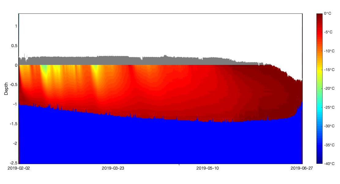


- An SIMB3 data sheet (or sample below)
- MATLAB (this tutorial is verified back to at least version R2017b)
A quick introduction
One of the best parts about working with SIMB3 data is that the results are highly visual. With the surface and bottom rangefinder data alone we can see how the ice (and snow!) change thickness through the season. By incorporating data from the vertical temperature string, we can examine the vertical conductive heat flux. If we combine all three measurements, we create a comprehensive picture of the ice state through time that we refer to as a mass balance plot. The mass balance plot
A mass balance plot shows ice and snow growth, melt, and internal temperature on a single, easily understandable figure (Figure 1). On the x-axis is time and on the y-axis is thickness or depth. As the ice grows and melts, the distances recorded by the SIMB3 surface and bottom rangefinders lengthen and shorten. With a little knowledge of the SIMB3 dimensions and the deployment conditions, we can turn these distances into ice and snow thickness values. Over time, changes in these values represent ice and snow growth and melt.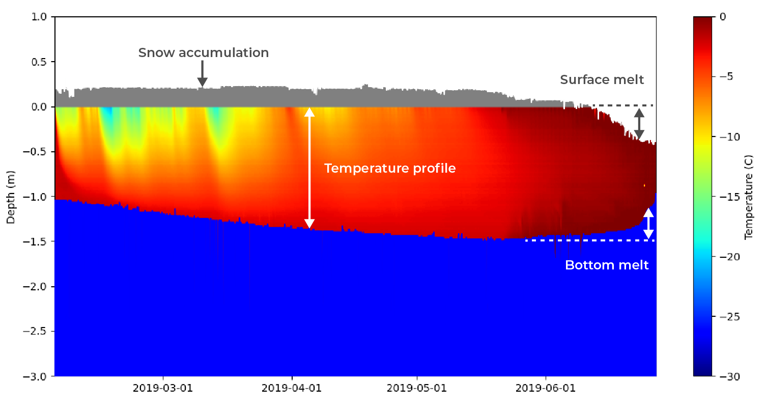 Figure 1: From the mass balance plot you can easily determine ice growth, melt, snow accumulation, and temperature profile visually. Because SIMB3 independently measures surface and bottom position, surface and bottom melt can be distinguished.
Time-series line plots
SIMB3 is also equipped with sensors that measure upper-ocean temperature, battery voltage, and meteorological data such as air temperature and barometric pressure. Creating these plots is straightforward compared to the mass balance plot, so we’re not going to cover it in this article.Creating the mass balance plot function
Okay, let’s jump right into it. We’re going to start by creating a function that takes in data and creates the filled-layer mass balance plot. We’ll then create a script file that calls our function, passing it data from the the SIMB3 datasheet. To create the mass balance plot function, create a new MATLAB file and name it massBalancePlotF.m. Open the file, and paste the following code into it. Don’t worry, we’ll explain this block-by-block below.massBalancePlotF.m
Preparing the arrays
In the first block of this function, we take each of our arrays and transpose their rows and columns. This reshapes the 1D arrays into row vectors of length N, where N is the number of entries in the SIMB3 datasheet that we wish to plot For the 2D DTC array, each row represents a reading from one thermistor on the DTC. A column is a collection of DTC readings (192 in total) along the buoy length at one point in time.Define reference height from ice surface
In the next block, we create one scalar and two arrays that define the snow height (i.e., the snow thickness) and the ice thickness. The scalar value height_above_ice sets the buoy floatation height (the distance between the surface rangefinder and the ice surface). Here we calculate it as the first surface rangefinder reading plus the snow height at deployment, but it can also be set manually. Often, this value is constant across SIMB3s, but variations in water density (especially between fresh and saltwater ) will cause SIMB3s to float at different heights during deployment and freeze-in.Realign Excel timestamp
To plot dates along the x-axis, we need to realign the Excel serial date to the proleptic ISO calendar used by MATLAB (days since 00-Jan-0000). Fortunately, MATLAB has a built-in function that makes this easy.Temperature string height reference
Moving along to the third block, we create several variables which define the position of the temperature string relative to the SIMB3 surface rangefinder and ice surface.Plot temperature string values
As the last step before we can plot the temperature string values, we need to create a vector to represent the vertical spacing of the DTC. To do this, create a vector spanning from temp_string_top to temp_string_bottom with 192 values. Then, create a 2D array of x & y pairs using meshgrid().Plot rangefinder values
MATLAB makes it quite easy to add filled-area regions representing the SIMB3 surface and bottom rangefinder measurements. While there are several ways to do it, we’ll do it using the patch() function which creates polygons from lists of x and y coordinates. Note that the first elements in the x and y arguments correspond to the boundary that we want to plot (snow height, ice thickness, etc.) and the second elements correspond to the location that we’d like to plot up or down to.Calling the Mass Balance Plot Function
To call our massBalancePlotF() function, create a new file and name it massBalancePlot.m. Open the file, and add the following code: