A quick introduction
One of the best parts about working with SIMB3 data is that the results are highly visual. With the surface and bottom rangefinder data alone we can see how the ice change thickness through the season. By incorporating data from the vertical temperature string, we can examine the vertical conductive heat flux. If we combine all three measurements, we create a comprehensive picture of the ice state through time that we refer to as a plot a mass balance plot.The mass balance plot
A mass balance plot shows ice and snow growth, melt, and internal temperature on a single, easily understandable figure (Figure 1). On the x-axis is time and on the y-axis is thickness or depth. As the ice grows and melts, the distances recorded by the SIMB3 surface and bottom rangefinders lengthen and shorten. With a little knowledge of the SIMB3 dimensions and the deployment conditions, we can turn these distances into ice and snow thickness values. Over time, changes in these values represent ice and snow growth and melt.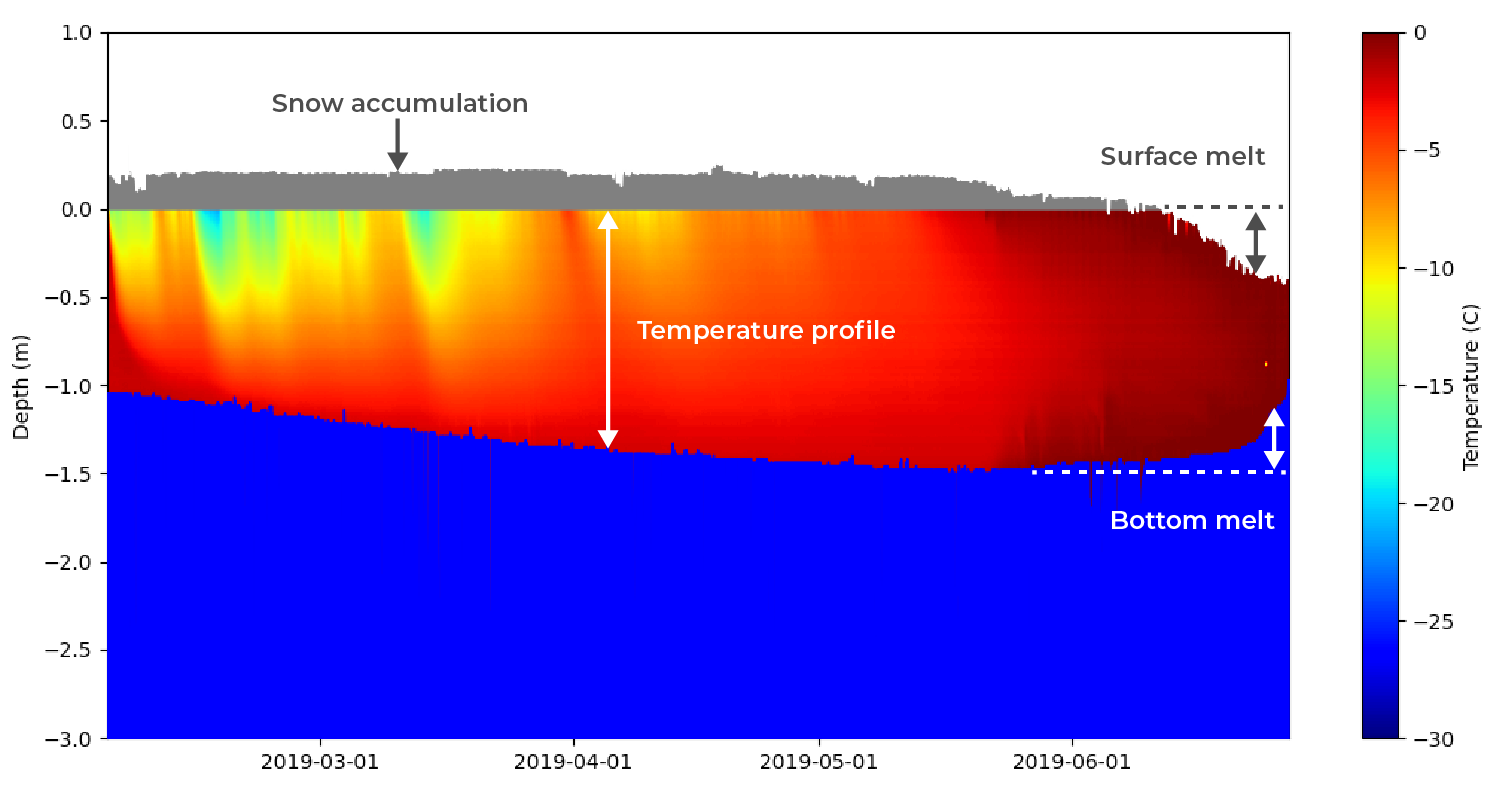 Figure 1: From the mass balance plot you can easily determine ice growth, melt, snow accumulation, and temperature profile visually. Because SIMB3 independently measures surface and bottom position, surface and bottom melt can be distinguished.
Time-series line plots
SIMB3 is also equipped with sensors that measure upper-ocean temperature, battery voltage, and meteorological data such as air temperature and barometric pressure. Creating these plots is straightforward compared to the mass balance plot, so we’re not going to cover it in this article.Getting started with Python
Okay, let’s get right into. From the Real Time Data portal, navigate to the page for the SIMB3 which you’d like to analyze. Click the green “Download CSV” button to download the most recent datasheet for the instrument.Create a new Python file
Inside of your code editor or terminal, navigate to a directory where you’d like to store your files for this project. Create a new file and give it a name and .py extension. We created a directory named SIMB3_Python and a file named massBalancePlot.py. While not required, I’d recommend moving your freshly downloaded datasheet into this directory. In a MacOS/Linux terminal:Installing required libraries
We’ll be using the Numpy, Pandas, and Matplotlib libraries to structure, manipulate, and eventually plot our data. To import them, open your Python file and add the following lines at the very top.Creating the mass balance plot function
For the mass balance plot, copy the following code directly below your import statements. Don’t worry, we’ll explain the whole thing block-by-block below.plot_simb3.py
Define reference height from ice surface
We tried to give the variables in this function intuitive names, but let’s still go through it block-by-block to make sure there’s no confusion. In the first row, we calculate the fixed distance between the surface rangefinder and the ice surface by summing the first value in the surface_distance array (i.e., the value immediately after the buoy was deployed) and the initial snow height. You can also declare this value manually using measurements from deployment.Snow height and ice thickness
We then create two arrays that define the snow height (i.e., the snow thickness) and the ice thickness. The snow height is simply the height of the surface rangefinder above the ice (does not change once the SIMB3 is frozen in) minus the reading from the surface rangefinder.Temperature string height reference
Moving along to the second block, we create several variables which define the position of the temperature string relative to the SIMB3 surface rangefinder and to the ice surface.Realign Excel timestamp
While this is not strictly necessary, to have dates to plot along the x-axis, we need to realign the Excel serial date to the 1970 epoch used by Python. To do this, just add the number of days (including leap years!) between 01/01/1900 and 01/01/1970. Note that you must also subtract one extra day to account for the infamous Excel leap year bug. For more on how dates are handled in excel, check this out.Plot window parameters
Finally, we set the bounds for our plot window. For most buoys, 1 m above the ice surface and 3 meters below the surface is good.Plot temperature string values
We’re now ready to assemble the mass balance figure. We’ll start by defining a plt.subplots() object, and then we’ll pass it our temperature string data. Here, the imshow() function takes in our digital temperature string array (dtc) and the bounds of the mesh over which we want to plot (in this case, on the x-axis from the first to last entry in timestamp and on the y-axis from temp_string_bottom to temp_string_top). imshow() plots the temperature string data and plt.colorbar(im, ax=ax) adds a colorbar with bounds defined by vmin and vmax. Both vmin and vmax should be set so that they encompass any temperature value present in the temperature string array.Plot rangefinder values
As the final step in the creation of our mass balance plot function, we’ll fill in the regions of our plot corresponding to air, snow, and water using the rangefinder values. This is straightforward using the fill_between() function.Calling the mass balance plot function
To call our mass balance plot, we need to parse our CSV datasheet and pass the required parameters into the plot_simb() function. To do this, let’s make an another function that takes our data path, initial snow depth, and plot range in as arguments and then calls plot_simb().Running the script
To run the script and create the plot, go back to your terminal and run: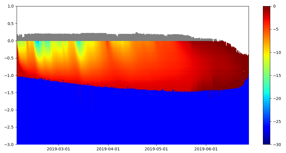 Figure 2: Our final mass balance plot, generated using open-source software.